Uppyn's Blog
The world through Dutch eyes in Sydney
Learning R: stepping away from Excel
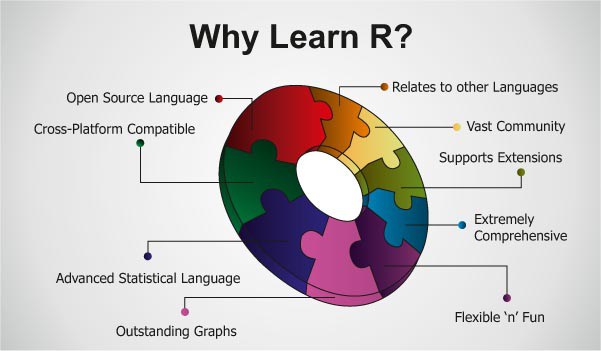
image source
Advanced Excel user
About 10 years ago I started to look for data processing tools that can be an alternative to excel. The need arose at work to use a data analysis platform that allows the user:
- to have better reproducibility of the analysis
- to experience fewer data quality problems in the sense that corrupting cells in excel is so hard to avoid, especially if there are multiple users
- to apply more powerful algorithms
- to deal better with expanding data files without ending up copying formulas into the new data
- create great looking and complex graphs
- the not spend a great deal of money
Don’t get me wrong, excel is a versatile tool that has many useful applications. I have used array formulas in Excel, have applied it to data files with hundreds of thousands of lines, done the VBA thing and used all of this in a professional manufacturing environment in high volume electronics
Climate and R
If you have, like me, a more than passing interest in climate science and you are an engineer it helps if you have some understanding of the R statistical environment. Once you have mastered the key concepts in the global warming discussion, the question that inevitably presents itself is: what does the data tell you? The data beats the mainstream media and politics if you want to know what is going on.
Once you arrive at that question, a whole new universe opens itself. Many sources of information are available that allow you to directly look at the data. The KNMI (Dutch bureau of meteorology) becomes your friend as they have a website that provides access to essentially all climatic data and climate model output. Many universities publish raw data on their websites. You find that many scientist and bloggers alike use such websites to get their data. What happens if you have the data? Things get harder! Climatic data is often multidimensional, discouragingly lengthy and complex. As so many, I started by dumping the data into Excel as this is the data processing tool that most of us know. It is tempting to use Excel because we use it so often. Bad idea!
The problem with Excel, when handling large amounts of data, is that Excel puts the data in the center. The processing of the data and turning it into information is hard, slow and inconvenient in Excel. And this is where programming or scripting languages come in. Scripting languages such as R put the data processing algorithm in the center. This turns out to be nifty: if more data becomes available, you only have to obtain the new data (e.g. download it from the KNMI climate explorer) and run your script. And voila, updated information appears at the press of a button.
R
R is an open source statistical programming environment. That means it is free. If you ask the R guys what R is, you get this:
R is an integrated suite of software facilities for data manipulation, calculation and graphical display. It includes
-
an effective data handling and storage facility,
-
a suite of operators for calculations on arrays, in particular matrices,
-
a large, coherent, integrated collection of intermediate tools for data analysis,
-
graphical facilities for data analysis and display either on-screen or on hard copy, and
-
a well-developed, simple and effective programming language which includes conditionals, loops, user-defined recursive functions and input and output facilities.
Well, I have some thoughts about the ‘simple’! After some time (it can be a while, the R learning curve can be steep) you start to understand that in R you can:
- Load data in a variety of formats (e.g. excel, csv, text etc)
- Apply analytical functions to the data (mostly statistical, e.g. mean, standard deviation to name a few very basic functions)
- Create scripts (programs) where you store your analysis into, so you can run them again later
- Plot your analysis results into charts
I use R at work, being in quality means to regularly work with real world data.
Simple example
Recently I read a blog post by Willis Eschenbach about snow cover in the Norther Hemisphere. Willis is smart guy who blogs regularly at WUWT. In his blog post he speaks about the impact of albedo on climate. He says a couple of smart things about it, as he usually does. Read the post yourself if you are interested. He presents an analysis of northern hemisphere snow cover and he presents a chart, which I recreated at home using R. He was so kind as to link to his R code that he used for his analysis. The data comes from Rutgers University who have a department that tracks snow cover.

Figure 1: Northern Hemisphere snow cover analysis
This looks like a complex image with a substantial amount of data processing, and it is! The original data is shown in the top panel, a trend in the second panel, a seasonal analysis (average) in the third panel and finally the remainder between the observed data and the seasonal component in the fourth panel. In R you can do this with less than 10 lines of code! Try doing that with Excel!
The R code is here and let me talk you through the code.
# data source http://climate.rutgers.edu/snowcover/table_area.php?ui_set=0&ui_sort=0
options(digits=4)
rsnow=read.csv("rutgers snow 2013.csv")
A reference to the source of the data is provided as a comment (# means comment). The ‘options’ command determines how many significant digits I want and the read.csv function looks for the csv file “rutgers snow 2013.csv” in my working directory. It reads the data into a variable called “rsnow”.
The ts function creates a time series from the date (newts) and allows us to apply an analysis relevant to time series. The function looks at data onwards from 1966 with a weekly resolution (frequency = 52). The window function selects the relevant time period in order to avoid data with gaps. And the third line checks for empty data records.
The decompose function is an excellent example of powerful high level analysis functions in R. It decomposes the time series into a seasonal (average) time series, a residual and and a trend. The object “mydecompose” is then plotted and a title of the plot is defined.
Conclusion
R is a pretty cool environment if you are interested in data and data analysis. It certainly takes a while to learn but it may be a good skill to have.
What does 95% certainty mean?
When you read the news from the IPCC about the latest climate predictions it is hard to not be impressed by the confidence that the climate scientists have in their models. They make statements such as:
It is extremely likely that more than half of the observed increase in global average surface temperature from 1951 to 2010 was caused by the anthropogenic increase in greenhouse gas concentrations and other anthropogenic forcings together. The best estimate of the human induced contribution to warming is similar to the observed warming over this period.
And extremely likely in this case means 95% certainty. But I ask myself, what does this mean?
The IPCC has just published its fifth summary for policymakers (SPM) and a couple of weeks ago they have leaked the report from the so-called working group 1 (WG1 which looks at the physics of climate change). One would expect that these documents would contain an explanation of how this level of confidence was determined. And that there would be a section in the report that would provide insight in the calculation of these confidence intervals. But you would be disappointed.
Confidence interval
So what is the meaning of a confidence interval in statistics? Well, your gut feeling would tell you it must be something like this: suppose I am interested in the average weight of men older than 40 years in my suburb. I would then go out and collect data by weighing some of my neighbours and calculate their average weight. Some of my neighbours may think this is a bit strange so I may only get ten neighbours to agree with me. But in the end I have calculated an average weight of 75kg and I hope that this would tell me something about the weight of all men in my area. Off course, I did not measure all the men in my area and because of that, I am not certain of the average. If I would have measured all men, I would be absolutely certain. So I need to make an estimate of my confidence. In some way I have calculated a 95% confidence interval around this average and it turns out to be 71 to 78kg. Now what does that mean?
Well, it depends on which statistical theory you believe in. If you are a ‘frequentist’ then a confidence interval means something like this: if you repeat your experiment an infinite number of times, which is pretty hard to do, and you would collect all the data and calculate all infinite averages, the real and true average of the weight of men in my area would be between 71kg and 78kg, 95% of the time. This says nothing about the one experiment that I just did. Not very helpful, is it?
On the other hand, if you are a Bayesian statistician, the conclusion is a bit closer to home. These guys call this interval a credible interval and it means what we really want: the chance that the average from my experiment will be between 71kg and 78kg is 95% percent. This makes sense but unfortunately, the math is now a lot harder!
But for both interpretations, the confidence interval tells me something really important: I can never be totally confident about the average weight of the men in my area until I have measured them all. In other words, my confidence comes from the data that I collected!
Models
But things get really tricky when it comes to climate. Unlike other disciplines, climate scientist cannot easily do experiments with the climate. They have to rely on computer models instead to make predictions. That means that there is no observational data to work with and to calculate averages from. So how do they do it?
The most common way goes like this: you get a bunch of very smart physicists and let them make a computer program that simulates the climate of the planet. This program will predict the average temperature of the planet. You let them run the computer models many times and every time you run it, you change some parameter of the model. For instance, you let it run with slightly different starting conditions. Or you let it run with some physical parameters set to a different value. As a result, every model run will be a little different. Then you ask your colleagues to make their own version of the models. And you let them run it many times with different parameters as well. If you are the IPCC you do this for more than 100 models. In the end, you pile all those climate model runs on top of each other and you see a kind of envelope emerging. This is called ‘ensemble runs’. The average of all runs then becomes the ‘most likely’ value of your prediction. (in reality, this is much more complex, e.g. the IPCC runs so-called scenarios for how they think carbon dioxide emission will be in the future). In this way, climate scientist work out how much variation there is to be expected in their predictions.
Because of the physics that goes into the models, and some of it is not at all well understood at the fundamental level, climate scientist claim they are able to separate natural variation (what the climate would do if we were not there) from man’s influence. They model, and publish in the reports, graphs that show how the world would have warmed (or not) with and without man’s carbon dioxide emissions. In my humble view, there are big problems in this area. For example, the influence of clouds and aerosols (soot and dust) is not well understood. Climate sensitivity (how much will the planet warm if CO2 doubles) is another area of heated debate.
We are now getting closer to what we want. But first ask yourself, is this way of coming up with an estimate of variation a good way? It may be the only way, but suppose your model has a problem? For instance, it does not get the clouds right? And as most models are based on the same basic physics, it may well be that they all get the clouds wrong. That would mean that all your runs are suddenly suspect. What does that do you’re your estimate of variation?
What about the data?
But we have to move on! Now, what about the data? Yes, this is where the data comes in. There are 4 main data sets available for global temperatures and they are all very close. I now have my model runs and my data so I can start comparing. How does one do this? The math is somewhat involved but you could do a statistical test and ask yourself if the model predictions and the observations are the same. Actually, the temperature trends of the models and observations are compared because the trend is not so sensitive to year on year variation. And the trend is actually what we are interested in. For such a test you have to define the confidence level and it is customary to choose 95%.
Independent statisticians do such work (e.g. Lucia Liljegren or Steve McIntyre) and what they find is remarkable: the average of all those climate model runs is not consistent with observations with 95% confidence! In fact, they find that most models predict temperature trends that are much higher than what we observe. See the figure below.

Figure 1: On the horizontal axis we see climate model runs and on the vertical axis we see the temperature trend. The red line is the average trend between 1979-2013 from HadCrut4 data (image source).
The box plots show the computer model ensemble runs. Note that the observed trend is well below the vast majority of the climate model predictions for the period mentioned!
Careful conclusion
To return to the IPCC statement, they are 95% confident that at least half of the warming between 1951 and 2010 was caused by humans. That is a lot of confidence given the challenges that are still out there.
What should we make of this? Off course, the IPCC speaks about the period from 1951 to 2010. And the data is clear, there has been warming in this period. Probably about 0.8 of a degree. But when we look at the last 15 years it becomes clear that the tool of choice for the climatologists, computer simulations, makes predictions that are well above what is observed. If we would follow the scientific method, we are getting ourselves into serious problems. The scientific method requires us to test, through experiment or observation, if the real world behaves as predicted by our theory. If our tests agree with the theory, our confidence increases, otherwise it decreases.
Now ask yourself again, how certain are you about this 95%?
Paul
Reading suggestions
Skeptical view:
Consensus view:
Note
I am not a climate scientist, but an engineer who started to read up on climate change a couple of years ago after a friend started to ask some uncomfortable questions about the consensus view. Disturbingly, I found that there is a lot that cannot be explained by the consensus. My views on climate change can be characterized as follows: the basic physics of radiative transfer of heat through the atmosphere is correct and more CO2 will warm the planet, all else being the same. Where I disagree with the consensus is that this warming will be catastrophic (as far as we can tell today) and that it does not warrant draconian measures on the world’s economy. As Australian film maker Topher Field says about climate change mitigation measures in his 50 to 1 project: if they are expensive enough to be effective, they are unaffordable. If they are affordable, they are not going to be effective.
Learning R – simple linear regression
Basic linear regression is very important in engineering and science. In linear regression one tries to fit a line to whatever data you are sitting on top of. The objective is off course to investigate if that line would reveal a meaningful relationship between the variables of your data. The linear regression can also be used to test a hypothesis that tells you if the new-found relationship is statistically significant.
Depending on the format of your data, it is pretty easy to do a simple linear regression in R. To do that, we first need to get some data. In this case I use a simple data file that contains measurements of the boiling point of water as a function of height. The data is available on the internet but I downloaded to my hard disk. Here is the content of the file:
Learning R – a second step
In the last post I have done something very simple: I called the built-in data set ‘sunspots’ and drew a basic plot. With very basic means I can do some more to this plot. E.g. I can add a title and titles for the axes:
plot(sunspots,xlab=”years”,ylab = “sunspot count”,main = “Sunspot numbers”)
Learning R – getting started
Learning to work comfortably with a powerful statistics and graphics package has long been a wish. In my work as a quality manager I often come across problems that require me to perform either some statistical analysis or create graphs or both. I have laboured for years with Excel as do so many. But there are better ways!
Having read some of the work of professor Tufte (e.g. his amazing book “The Visual Display of Quantitative Information“) I am aware of the many other software solutions out there to tackle this problem: Minitab, Mathlab, S and R to just name a few. The attractive aspect of R is that it is available as open source software and free. And it is amazingly powerful! You can find several good examples of the graphing capabilities of R here. Read more of this post
My new blog
Hello world!
This is my weblog and it is a very new experience for me. The title and sub-title demands some explanation: Uppyn is the name of my viking ancestors and it is an inspiring thing to be able to refer to one’s ancestry in the title of this blog. The sub-title is pretty obvious: the world through Dutch eyes in Sydney. This blog will therefore be all about how I perceive the world while I live in Sydney. My observations, some of which will be serious, some funny (you be the judge of that), some stimulating will be presented here.
I start this blog as well to find easier ways to communicate with friends, family and anybody who would be interested. A few topics hold my profound interest:
- Science
- Global warming
- Movies and music
And I will blog about these topics more than about others. I also hope that this blog can become a place where I can show the strangeness of the world and share it with you.
Finally, as a non-native speaker, I hope that this blog will help me improve my English language skills as well as my ability to commit my thought to paper (in an internet kind of way).
This blog is a kind of experiment and I thought that the following quote from Ralph Waldo Emerson is very fitting:
All life is an experiment. The more experiments you make the better.
Enjoyable reading!
Paul
Hello world!
Welcome to WordPress.com. This is your first post. Edit or delete it and start blogging!
